Even the slightest change can make a considerable difference between what is called a good design and an excellent one. This is particularly true when it goes about a web design. Many website owners are aimed at creating the headings catching users’ eyes or arranging the text in a specific typography style. However, there is much more one should do to make a website attractive. It is necessary to admit that there are the specialists whose job is to test how people use web pages – what they see first when accessing a specific website, what buttons they press, how long they surf a specific resource, etc.
Your web page has to perform three main functions, i.e.:
- Grab users’ attention
- Highlight the advantages of using your services/products
- Encourage visitors to buy your products
The third of the mentioned functions depends on the CTA (call-to-action) button. It must be the most essential icon on your web page, as it impacts its conversion rate.
Designing a Call-to-Action Tab
The way which a CTA tab is designed in may exert a visible effect on how visitors use your website. A properly designed CTA tab should help you convert enquiring users into clients, subscribers, and those creating accounts on your website. Thus, how to create the CTA tab in a way that will persuade users to utilize your services? Consider the useful prompts presented below.
Make a Suitable Size
If you desire users to click your CTA button, you have to make it clearly visible meaning visitors should not spend much time finding it. For example, you can make this button larger than other items presented on your website. But don’t make it too big, you should balance the size of the button with other characteristics like color or shape to optimize visibility. If you have any doubts about the visibility of your CTA icon do a little test. Step back from your PC and squint into the website. If the button is clearly seen among other icons, you have made it of the right shape.

Choose a Suitable Color

It is stated that there is no unique color that could attract every single user. Nevertheless, you have to try to find the one that will fit your website best of all. The range of colors is broad and each of them can make a strong impact on visitors. Thus, ensure the chosen tone will not only match other colors presented on your web page but also influence users positively. What can help you choose a suitable color for the CTA button is its size. For example, if the button is large, it is better to select a dull tone, as a bright one may overwhelm the whole page. In case the button is small, it is worth applying some vivid shades to make it easily visible.
Let Users Know It can Be Clickable
Your CTA tab will be of no use if your website visitors do not understand that it can be clicked. You should realize that the way this button is designed in has a great meaning. Its purpose is not to make your website beautiful but to make users’ experience of browsing your resource valuable.
Therefore, it is vital to arrange this tab properly so that users understand it can be pressed. Here, you should consider the shape of the button. The majority of tabs are performed in a rectangular sharp/round-cornered form. If you decide to pick another shape, make sure it is visually clickable. To achieve a desirable effect, you may use highlights, shades, etc.
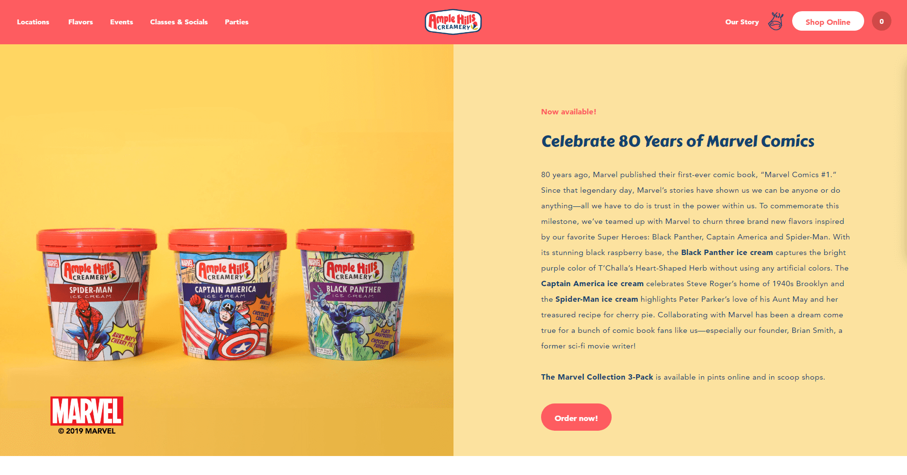
Mind the Contrast
Contrast matters regardless of the type of design we are talking about. Let us identify the role contrast plays in designing a CTA tab.
- Tab Color versus Background Tone
Your website visitors may not notice the CTA tab if its color melds with the background one. Try to pick the color that will make the tab stand out.

- Text Tone versus Tab Color
We believe that you do not want users to make much effort to see the text written on your CTA button. Therefore, try to select not only a lucid font but also a suitable color. Avoid applying the tone similar to that of the button and the ones that are unclear when combined together.
Choose a Proper Location
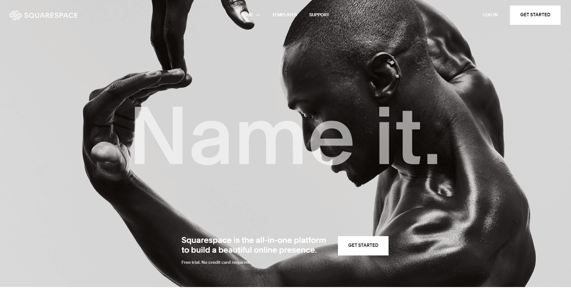
Once the button is designed, consider its location. Note that its position depends on the structure of the page.
It is advised to put the CTA button on the top of a page above all other items so that it is clearly seen by visitors. Such an approach is usually taken by newspapers editors. They present the material deserving scrupulous attention above the fold. One more option to make the button visible is to surround it with additional blank space. In this case, you have to make sure it is not located too close to other designer elements.

CTA Button as a Matter of Urgency
Making a proper design and picking a suitable position for the CTA tab is sometimes not enough to make users click it. It is required to refer to the visual means that will encourage users to press the button. For instance, you may put such words as “Today” or “Now” on the button. It is also possible to set the button with a timer showing how much time is left till the offer expiration (in case you are selling something) or give users temporary discount codes.
Keep in mind that the options you are using cannot be just a means of attracting users’ interest. The promises you make (here it goes about the mentioned discounts, a timer) have to be fulfilled. Otherwise, your visitors may think you are not focused on providing quality services.
Start a Dialogue

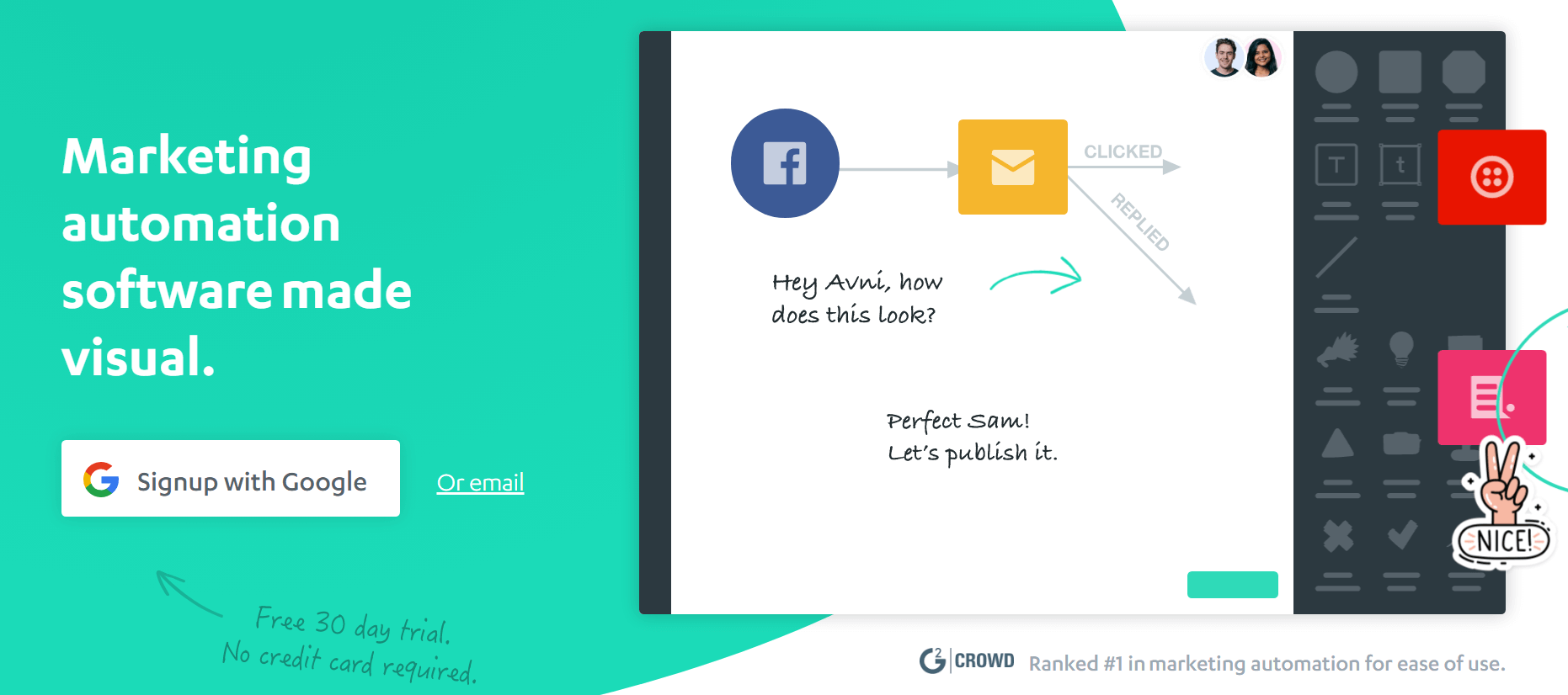
You do not want the visitors of your website to think that the text on the CTA tab forces them to take some actions, do you? Therefore, you need to make sure that text presented on the button is written in a friendly tone. Internet users surfing your website should feel like you are inviting them to participate in the discussion rather than trying to sell something. For example, your CTA tab may present such phrases as “Let us Talk!,” “Join Us!” etc. In this way, you will show visitors that you are interested in making conversations with them.
Be Precise
Online users accessing your website should understand what they will get once they click the CTA button. For this reason, you should make the text on the button concise and clear. If the appeal, which you want to present on the button, requires broad explanations, you may provide additional information below the button.
To Conclude
Even the smallest details count when creating both CTA buttons and design. If, by publishing this article, we have motivated you to look at the CTA buttons presented on your website with fresh eyes and arrive at a decision to make some changes, then our efforts were not vain. Note that you may use online generators devised for creating CTA buttons to pick the design that is the most suitable for your website. No one can state what color, font, or size of the CTA tab can increase the conversion rate. You are the only one who can pick the best tone for your CTA buttons.


