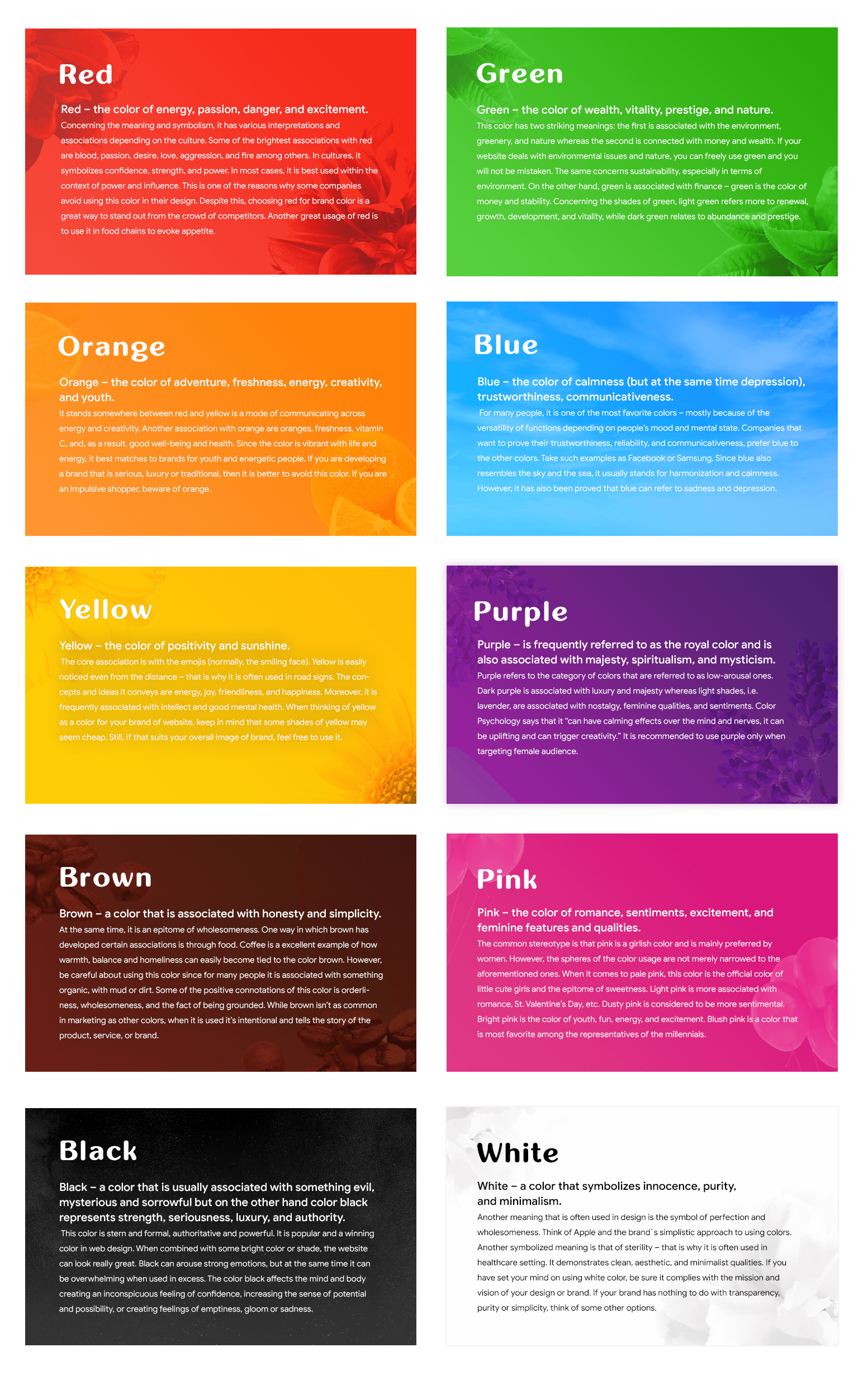
It is widely known that different colors have their own psychological influence on an individual’s mood, feelings, emotions, and even a way of conduct. This knowledge proved to be useful in such areas as website design, marketing, and business in general. Successful designers and marketologists have used this information for their benefit to ensure they derive profit from what they sell or offer. In some cases, color can be the only reason why some people prefer to buy a product. According to the results of an experiment, 93% of purchasers have indicated that they tend to buy some products merely because they liked their visual representation and appearance. What is even more impressive, 85% of them claimed that color is the decisive thing in making their choice.
Color does not add a pleasant quality to design – it reinforces it.
Colors have been granted some symbolic and special meaning for as long as people have been creating and building some new things. Over the years, people’s brains have learned how to perceive colors and associate them with certain features and qualities. Therefore, good color combinations matter greatly. When it comes to the color schemes of your website, then you should be particularly cautious and attentive about the choice of colors. Different colors evoke a range of emotions and feelings in people. For instance, the color red is like a trigger for action and bright emotions. When people see this color, they become attracted and excited. When it comes to the emotions and feelings associated with red, these are bravery, passion, and love among others.
People working in the sphere of brand and design want to find the best color combinations with the core aim to make the brand recognizable. According to the estimates, colors help people recognize a specific brand by 80%. Therefore, it is essential to work on it thoroughly. Reading this information, you might probably think that there is something magical about colors and their usage. Here comes the question: why would people fail to use these principles in the best way? The answer is simple: not many of them devote sufficient time to studying colors that go well together.
Select Your Primary Color
When you are designing your own website, it is recommended to select the main color for it. The primary color along with the logo are the first things that normally come to people`s minds when they think of the website. Therefore, it is strongly recommended to carefully study the color schemes for websites. The primary color for your own website is like blue for Facebook and red for Cola. This color should have an intention of evoking specific feelings or emotions while still drawing attention to special features of your website and its theme. If you want your website to be remembered, choose appropriate website colors.
Many people question themselves how they can possible select the most appropriate and perfect colors for the website. One of the ways is to do it intuitively but this is not really reliable and doesn’t always work out. It can help you succeed only if you have some innate feeling of what website color scheme will perfectly match the purpose and functions of the website.

What best colors for websites to choose?
When you read some stories of how big corporations have chosen their website or brand colors, you would never hear that the choice was made randomly. In cases of big companies, colors are chosen strategically and according to specific rules and principles. As such, these companies study their marketing initiative and branding concepts, and thus choose the best website color scheme that matches their needs and purposes. The thing is that different colors attract different kinds of target audience. More so, colors even have an impact on consumer behavior. Depending on the kind of customers you would like to attract, website colors should be chosen accordingly.

Color Schemes: How to Choose the Best Color for Website?
As soon as you have come up with the dominant color of your website, it is essential to choose secondary colors. If you wonder how to choose color combinations for website, it is recommended to use the color wheel in order not to choose colors randomly but ensure they align well with each other. When you use the color wheel, you can choose some popular color scheme among the following options:
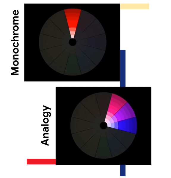
- Monochrome
If you want to choose one color but experiment with different saturation and shades, it’s recommended to use monochromatic schemes. There are certain risks about this choice – the impression of blandness and simplicity. However, such color schemes are most favorable for the eye. If you really prefer monochromatic schemes but wouldn’t like your website look simplistic, try to strike a balance between monochromatic and analogous or complementary schemes. Just splash some bright color.
- Analogy
Analogous colors are those that stand opposite each other in the color wheel. Normally, the combinations they form are pleasing for the viewer. They provide a harmonious effect since these are the shades of colors that are easily found in nature. Analogous colors are placed in gradation to the colors that are adjacent to them.

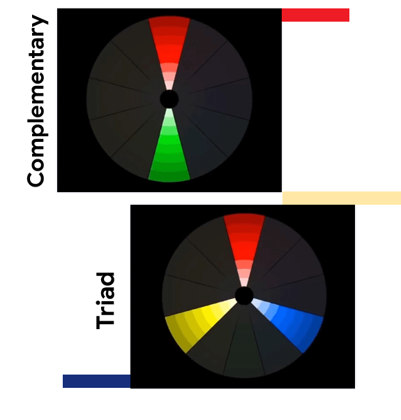
- Complementary
These are the colors that are contrasting in the color wheel. When put together, they are vibrant and bright. Moreover, they easily attract attention of viewers. They are recommended to be used carefully since they emphasize details. So, if you do not want to highlight specific details, do not make them stand out.
- Triad
To form a triad of colors, you need to draw an imaginary triangle on the color wheel. The three colors you choose will be situated evenly separate from one another. A popular color triad consists of orange, green, and purple. Among the three colors, one is always dominating.
On the whole, it may be overwhelming for one to choose colors for the brand design or the website. Normally, people do not like to select some popular color scheme but at the same time find it tedious and boring to study some complex combinations. Sometimes, the easiest way to choose a color scheme for the website is to make it simple and pleasing.

Select Your Accent Color
Accent color is the primary one that is supposed to draw attention of the target audience to some important elements and sections you would like to emphasize. If the accent color was not properly identified or if the background color seems brighter than the accent color, keep in mind that your message might not be evident. As a result, people may miss something that is crucial for you. The difference between the dominant color and the accent color is that the latter is normally bolder. Accent colors are predominantly applied for texts and buttons, such as the navigation menu, website items, call to action, etc.

Select Background Color for the Website
The process of choosing the background color for the website resembles the process of choosing the color for your home walls. The effect is virtually the same. Why are you so picky about the wall colors? – Because you would like them to be pleasant to view and want to feel comfortable while being in tha room. The same is about the website – the colors of the background should make the website pleasing to the eye. If the colors are annoying, hardly any person would want to browse the website further and read the content hence the need to make the background pleasing to the eye. The background should not distract your website viewers from the content and the core message you intend to convey. When picking the color, make sure the background corresponds to the primary goal of the website.

Follow the 60-30-10 Rule
Once you have completed the color palette for the website, you can partially wind up but remember that the work is not complete yet. The 60-30-10 rule refers to the following: 60% of space should be taken by the dominant color of the website; 30% of space should be devoted to the secondary color; and 10% is given to the accent color (normally, this color is used in text). If you deal with web design, you can adjust the rule as follows: 60% to the negative space; 30% to the content; and 10% to the elements that intend to call one to action.

Take into Account Shades and Tints When Selecting Complementary Colors

Once you have chosen the primary color for the website and have agreed on the basic color scheme vision, it is essential to consider the other aspects of website color scheme. Particularly, pay attention to shades, tones, and tints of your chosen colors.
- Shades
To create a shade of any color, one should add black to the selected hue. Resultantly, you will get a richer and darker color. Shades are used to get intensity.
- Tones
Tone is something in-between the shade and tint. It refers to the grey area. While shades are created by adding black, tones are achieved by adding either black or while to the original hue.
- Tints
To create a tint, it is necessary to add white to the main color in order to desaturate or decrease the intensity of color.
Remember that too bright color combinations may be annoying and unpleasant to the viewer. Striking colors have a negative impact on eyes. Therefore, experiment with color schemes to be sure that the colors are not painful to the eye.
Conclusion
Remember that your choice of website color design and color schemes should not be solely based on your preferences of colors. When you are designing a website, colors should be never chosen randomly. Be sure to make the color scheme pleasing to the eye and also take into consideration the target audience to make the website appealing.


